I am constantly asked about how I pick the right framing for pieces of artwork. First and foremost, I make sure the frame and materials I choose are going to support the size of the art and protect it from deterioration over time. There are also some rules of thumb I like to follow about color and size, but the simple answer is I pick what I think looks good with the artwork.
If you have ever had something framed, you know that it isn’t always as simple as that. A piece of art can be framed 10 different ways and look great each way.
• Do you choose certain colors and frames because they will go in my room?
• Do you use a mat? If you do, how large should it be?
• Should the framing be bold, minimalist, dark or light?
I have seen nice pieces of artwork that look bad with poor framing selections while at the same time I have seen poor artwork look great with proper framing.
When framing something be open to all ideas and designs. You never know what might look great to you is not what you had thought.
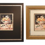
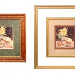
To highlight this I took 2 sets of the same artwork and framed them dramatically different. As you can see from the side by side comparison that framing can make art look very different. You can make a small piece of art large or small depending on what you do. You can make a traditional piece contemporary and vice versa.